9 min read
Overview
Optimizing your add-on's titles, descriptions, and presentation is key to making it easy for developers to quickly understand the value and functionality of your product. A clear and engaging presentation increases visibility, drives higher usage, and ensures a better experience for users on the QuickNode Marketplace.
This guide provides detailed instructions on creating and optimizing your add-on for the QuickNode Marketplace. From creating concise titles and descriptions to selecting impactful visuals, adhering to these guidelines can streamline your application process and increase your chances of standing out in the Marketplace.
Title Guidelines
Your add-on's title is the first thing customers see. Make it stand out by following these required best practices:
- Intuitive and Clear: Ensure the title is easy to understand and reflects what your add-on does.
- Five Words or Less: Keep it short and concise.
- Capitalization: Capitalize the first letter of every word.
- Unique/Descriptive Words: Differentiate your add-on from similar ones by including a unique or descriptive term.
- Example: DeFi Price API instead of Price API
- Include API, JSON RPC, or SDK (optional): Where appropriate, append this to your title to clarify what your add-on offers.
- Example: DeFi Price API instead of DeFi Price
- Exclude Company Name: Your company name will automatically appear in the listing, so no need to add it to the title.
- Example: DeFi Price API instead of DeFi Price API by QuickNode
| Good Title | Why It’s Good |
|---|---|
| DeFi Price API | Clear, concise, and includes a descriptive word (DeFi). |
| ERC-4337 Bundler SDK | Specific and descriptive, clearly communicating what the add-on does. |
| NFT Analytics API | Direct and straightforward, using keywords developers are likely to search for (NFT, Analytics). |
| Solana Validator Dashboard API | Provides clarity by specifying the blockchain (Solana) and the type of service (Validator Dashboard). |
| Bad Title | Why It’s Bad |
|---|---|
| QuickNode’s DeFi Add-On | Includes the company name unnecessarily and lacks specific details about functionality. |
| Super API | Too vague; doesn’t explain the API's purpose or target audience. |
| Validator App by [Company Name] | Repeats the company name and is not specific enough (what kind of validator?). |
| General Blockchain Toolkit | Too broad and generic; lacks focus on what the add-on actually offers. |
Short Description Guidelines
This is your elevator pitch. Use this space to describe your add-on in a brief and impactful way.
- Maximum Length: 200 characters (about 2 sentences).
- Focus on Value: Explain how your add-on helps developers.
- Direct and Clear: Avoid unnecessary words and get straight to the point.
- Avoid Self-Promotion: Do not include your company name, add-on name, or promotional language.
| Good Description | Why It’s Good |
|---|---|
| Send user operations and create smart accounts using this ERC-4337 bundler API. | Directly highlights the add-on's core functionality and value. |
| Instantly decode and categorize blockchain transactions, turning raw data into actionable insights like "Add Liquidity" | Clearly explains the key benefit and real-world use case. |
| Enter your wallet address to get monthly cashback on gas fees and secure your transactions at the same time. | Describes the benefit and functionality in a concise and impactful way. |
| Analyze Solana NFTs in real-time with comprehensive data on ownership, historical records, and collection insights. | Describes specific use cases and features in a clear, user-centric way. |
| Bad Description | Why It’s Bad |
|---|---|
| Our Add-On helps create smart contracts with ERC-4337. | Mentions "Our Add-On" and lacks detail about the actual benefit for developers. |
| [Add-On Name] turns raw blockchain data into insights like "Add Liquidity." | Includes the add-on name unnecessarily and lacks a developer-oriented explanation. |
| Get gas cashback with [Add-On Name] by QuickNode: the best way to save on gas fees! | Repeats the add-on name and uses promotional language instead of focusing on developer needs. |
| Track Solana NFTs using [Product Name] for in-depth insights on real-time ownership and historical data. | Repeats the product name and is too promotional without emphasizing the core functionality or user benefit. |
Long Description Guidelines
The long description is an expanded version of your short description. Use this section to explain the key features, use cases, and benefits of your add-on.
- Expand on Short Description: Focus on developer use cases, tool/programming compatibilities, and unique features.
- Avoid Specs: Save details like Requests Per Second (RPS) for your plan tiers.
- Five Sections Maximum: Structure the long description with up to five clearly defined sections, each covering a specific aspect of your add-on.
- Section 1: 2-3 sentences describing the first key feature or benefit.
- Section 2: 2-3 sentences describing the second key feature or benefit.
- Section 3: 2-3 sentences describing the third key feature or benefit.
Market Coverage:
CoinPaprika stands out with its broad market coverage, encompassing over 71,000 assets and 330+ active exchanges. This extensive reach positions it as a leading provider in the API market.
Data Richness:
From real-time price feeds and historical OHLCV data to detailed information on exchanges and even social media trends, the CoinPaprika API delivers a comprehensive view of the cryptocurrency landscape.
Reliability and Performance:
With a commitment to 99.9% uptime, backed by service level agreements, developers can rely on consistent access to data. The API boasts a high refresh rate of 20 ticks per second, ensuring that data is delivered with minimal latency.
Developer-Friendly Design:
CoinPaprika prioritizes ease of integration. It offers open-source libraries for a variety of popular programming languages, including Javascript, Python, PHP, Go, Rust, C#, Swift, and Kotlin.
Dedicated Support:
Real-time customer support is available via Slack (on selected plans), reflecting CoinPaprika's dedication to assisting its users. This, combined with a dedicated IT infrastructure, reinforces its commitment to a seamless user experience.
Pricing Guidelines
Setting appropriate pricing for your add-on is crucial for balancing value and accessibility. Your pricing should reflect the features offered, the volume of usage, and the needs of your target audience.
- Multiple Paid Plan Tiers: Offer multiple tiers to cater to different user needs, ensuring the pricing reflects the volume of usage and features included at each level.
- Pricing Parity: Keep pricing consistent with what is offered on your website to maintain trust and transparency.
- Consider the value provided to users and the level of service required (e.g., data volume, speed, or premium support).
- Start with a basic plan that offers core features at a lower price to attract entry-level users.
- Include higher-tier plans with enhanced features or greater usage limits to cater to power users.
- Periodically review and adjust pricing based on market trends, user feedback, and competition.
Enablement for Enterprise Sales
For enterprise customers, positioning your add-on to meet their specific needs is key to driving adoption and maximizing revenue. Our sales team will use a co-branded Notion document to position your add-on to Enterprise Web3 and Fortune 500 clients, so it's important to provide clear value propositions specific to the Enterprise user persona. Consider including the following:
- Simple Explanation: Clearly explain how your add-on solves key business problems at scale.
- SLA/Reliability/Latency Guarantees: Highlight any uptime guarantees, response times, or dedicated support offered at enterprise tiers.
- Discovery Questions: Understand the unique challenges enterprise clients face and how your add-on can address them.
- Competitive Differentiation: Clearly define what sets your add-on apart from competitors in the marketplace.
- Common Objections and Responses: Prepare answers to typical concerns enterprise customers may have, such as scalability, cost, or integration complexities.
Please share the enablement document via a PDF or Word document in the shared Slack with the QuickNode team.
Feature Guidelines
Each feature should be highlighted concisely, allowing users to quickly understand what your add-on offers. Follow these best practices when listing features:
- Write 1 line per feature.
- Keep each feature to 10 words maximum.
- Include numerical features that showcase the add-on's capacity or performance.
- Include features that may vary based on the plan tier.
- 100 Requests per second
- 5,000 Requests per month
- 200+ Chains Supported
- 50+ Currencies
- 20 Methods Supported
Documentation Guidelines
Providing clear, accurate, and concise documentation is crucial to ensure developers can easily integrate and use your add-on. If your add-on includes RPC methods or REST paths, it's essential to follow these guidelines. Good documentation, with working examples and clear descriptions, will help keep them engaged and lead to higher adoption.
-
Sample Code: Every sample code snippet you provide should function correctly without errors. Test your code thoroughly to ensure developers can easily follow and implement it.
-
Short and Precise Descriptions: Your method/path descriptions should be short, to-the-point, and easy to understand. Overly complex or vague descriptions can confuse developers and hinder the integration process.
-
Provide Comprehensive Documentation: Each method or path should include a documentation link leading to well-organized, detailed explanations. Ensure the documentation covers everything a developer needs, including parameters, response formats, and example use cases.
Be sure to update your documentation with the URL to your QuickNode Marketplace listing, making it easy for developers to access your add-on directly.
Support Website
Ensure that your support website and email are fully functional and active. They will be the main channels for customers to get help with your add-on. A responsive support system builds trust and improves the overall customer experience.
Image and Video Guidelines
Video Guidelines
A 30-60 second walkthrough video is recommended to provide a dynamic overview of your add-on. Videos offer a visual and engaging way for developers to quickly understand your product and its benefits. We recommend using Loom or a similar tool to record the video.
- First section (~10 seconds): Start with a quick recording visually demonstrating the value users get from the add-on.
- Next section: Briefly explain what the add-on does, focusing on key technical capabilities and how it solves a developer pain point.
- Final section: Show the installation process and demonstrate making an API call via QuickNode, so developers can see how easy it is to integrate.
After your video is ready, send it to the QuickNode team as an MP4 file.
Screenshot Guidelines
Screenshots are essential visual aids that show users how your add-on looks and works. They render on the public QuickNode Marketplace website, so screenshots must be effective at helping the user through their enrollment and user journeys.
File Specifications
| Spec | Detail |
|---|---|
| File type | .png/.jpg |
| Background | Transparent |
| Minimum size | 1024px x 768px Avoid going too much higher than 1024x768px. Depending on the level of details, the images might be unrecognizable on certain screens. |
| Aspect ratio | 4:3 |
| Resolution | 72 dpi |
| Corners | No round corners |
Quantity
You are limited to a maximum of 5 screenshots per add-on.
Examples of Proper Screenshots
Screenshots can be used to either show how the interface looks or to highlight a specific product feature or quality:
| Highlighting a feature | Showing the user interface |
|---|---|
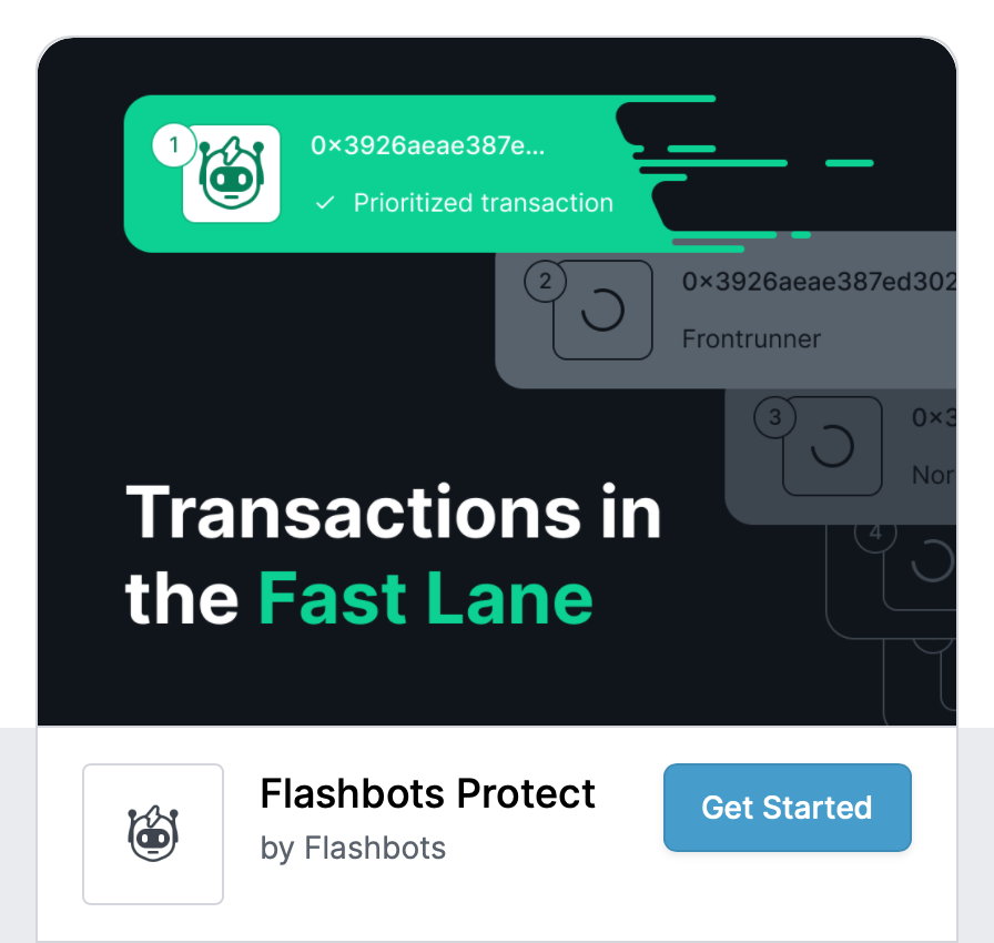 | 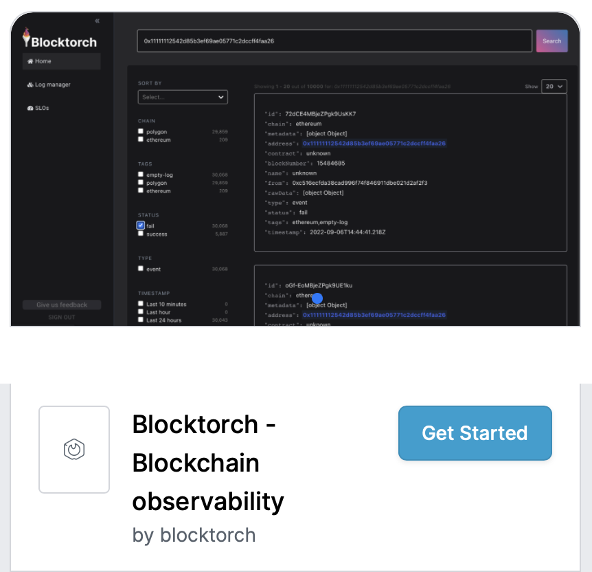 |
Icon Guidelines
The icon represents your add-on in multiple locations on the QuickNode platform. It must be clear, easily recognizable, and follow strict design rules to ensure a consistent user experience.
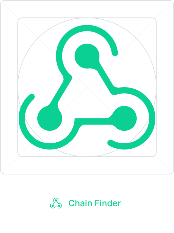
Here is an example of an icon in context:
File Specifications
| Spec | Detail |
|---|---|
| File type | .png |
| Background | Transparent |
| Size | 24x24px Avoid going too much higher than 24x24px. In some cases the icon will be resized down to 16x16px which will make the icon unrecognizable if it's too large |
| Aspect ratio | 1:1 (square) |
| Resolution | 72 dpi |
| Corners | No round corners |
Colors
- Foreground: Use dark colors with good contrast to ensure visibility against light backgrounds.
- Background: Only transparent backgrounds are accepted.
Grid
Your icon should be designed to fill 10/12ths (20px for a 24px icon) of a vertical or horizontal space. Make sure to leave a margin of at least 1/12th (2px for a 24px icon) margin around your icon that is free of any visual elements.
Example
| An example of an icon with a proper margin | Grid properly applied to the icon design |
|---|---|
 |  |
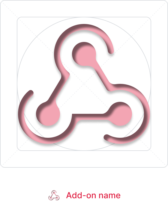
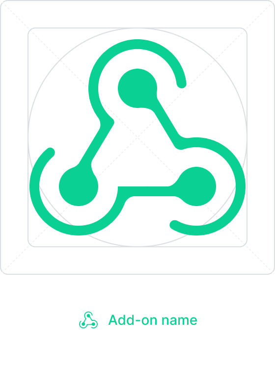
Contrast
| DON'T use low contrast foreground colors | DO use nice contrast colors. Transparent background is a plus! |
|---|---|
 |  |
Margins
| DON'T export the icon without any margins | DO give your icon some room to breath |
|---|---|
 |  |
Visual effects
| DON'T use drop shadows, bevel, emboss, or any other similar visual effects because those don't downscale well | DO use outline icons with proper line width. They look sharper while downscaling |
|---|---|
 |  |
Copy
| DON'T use excessive amounts of text in your icon. This makes it hard to identify and read at smaller sizes | DO use a mark that will visually represent your add-on |
|---|---|
 |  |
Ownership
| DON'T use a logo and a name you don't own | DO use a original mark and name |
|---|---|
 |  |
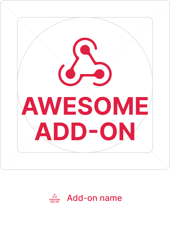
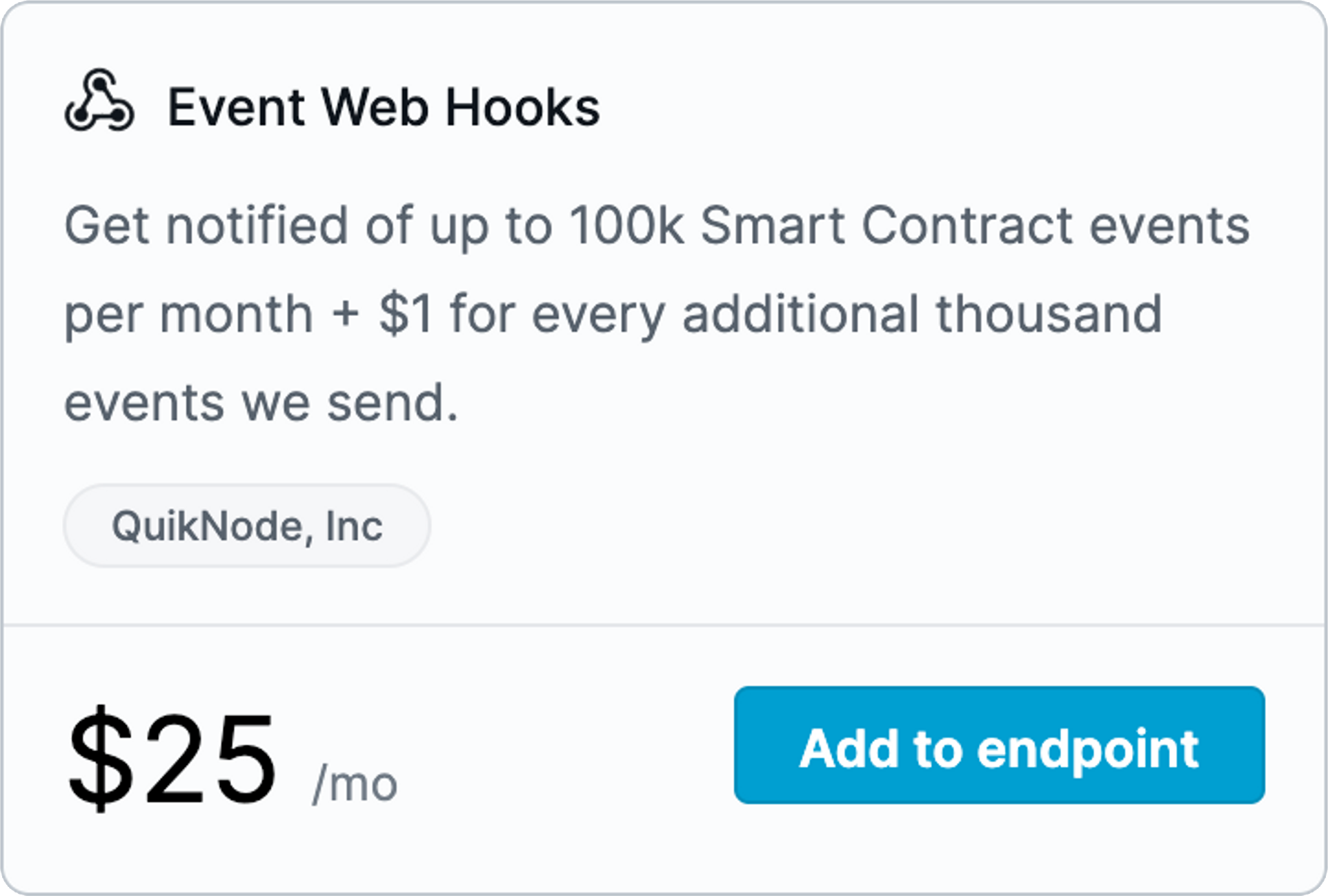
Example of a Proper Icon
In the top left corner of the add-on below, you will see an example of a proper icon that adheres to all of the guidelines.
Conclusion
By following these guidelines, you’ll ensure your add-on is well-presented, easy to use, and attractive to developers. All of these elements contribute to a positive user experience and help build a strong brand image for your add-on. If you have any questions or need further assistance, feel free to reach out to us on Discord or Twitter.
We ❤️ Feedback!
Let us know if you have any feedback or requests for new topics. We'd love to hear from you.